Components allow you to add any glyph from your .mkfont into other glyphs, enabling a very modular & atomic workflow.
What is a component?
Generally speaking, components are kindda like layers, or Adobe© Illustrator Symbols, or Prefab in Unity : they can turn any existing glyph into a re-usable asset that self-updates whenever modified.
They can be used for many many things : easily make and maintained composite letters with modifiers such as
é,àetc; but the logic also applies to creating flexible icon libraries. Check out theComposite icon font guide to get a grasp on the possibilities.
Using component is rather straightforward, yet there is a few not-so-obvious subtleties that make them really flexible.
The first thing to setup in a component is choosing which glyph it will ‘import’. A component may be empty, in which case it’s useless, or can reference a glyph that doesn’t exist just yet – in which case it acts as a placeholder that will behave as expected once the glyph it references is added to the font.
Note that the imported glyph can be any glyph, even a ligature – if you can see it in the viewport, it can be used as a component.
Header actions
| Action | Effect |
|---|---|
| Create | |
 | Creates a new empty component on top of the existing ones |
 | Open the glyph picker and let you pick one or more components and add them as components |
| Manipulate | |
 | Collapse all open component foldouts |
 | Toggle all layers to visible |
 | Toggle all layers to hidden |
| Composite | |
 | Create component for each glyph part of the known decomposition of the host. (See  Glyph details) Glyph details)
|
Flatten comps
Whether or not to flatten the components.
This is a bit tricky to use, and (mostly) only useful when working with lots of components imported inside an empty glyph.
What it does is first compute component transformations as usual, them flatten them as if they were a single entity, and then re-apply the global glyph transformations onto them.
This, among other things, effectively allows the glyph width to be controlled by its components.
Layer controls
The glyph preview is an inspection shortcut.
Visible on hover.
| Action | Effect |
|---|---|
 | Move the component up in the list |
 | Move the component down in the list |
|
/
| Toggle layers visibility |
 | Delete the layer |
Basic properties
The first thing to setup, as mentioned above, will be which glyph the component will be using. Not unlike a regular glyph, a component has then alignment & anchoring options, scale, and translation.
The main difference with a regular glyph is that the typographic space of a component is not the family. Instead, it is constrained by the glyph it is appended to.
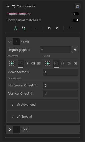
Import glyph
The
button open the Glyph picker and easily pick an existing glyph from your font.
It’s generally faster than the raw method below.
This is where you choose which glyph to import as a component. Accepted values are :
- A character, such as
a,b,0 - A ligature, expressed as
ab,bc,0g1,verbose-ligature-name(or what-have-you) - An
U+0000formatted character, such asU+0041,U+01f9, … - A ligature, expressed as
U+0041U+01f9 - A ligature, expressed as a combination of the above, with hex values terminated with a
-, such asabU+0041,abU+0041-i,abU+0041-iU+01f9.
Using the  button will inspect the glyph imported in the layer. You can quickly move back and forth between components and their glyphs using and .
Alignment & anchoring
There are two distinct alignment & anchoring : one for the Context (the component’ host), another for the component itself, Layer.
They are functioning in the same way as the  Glyph transformations.
Anchoring
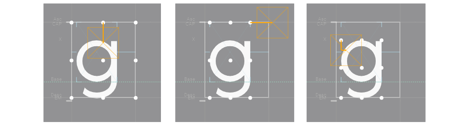
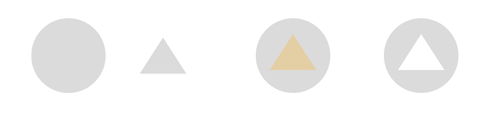
Taking a g as an example, here are the different possibilities for anchoring based on the selected boundaries :
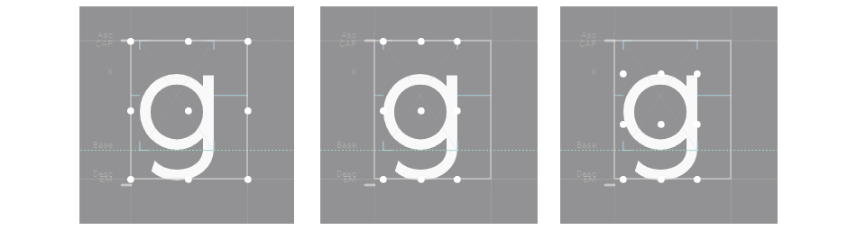
As you can see, this full bounds have nothing to do with the imported SVG, but instead uses the actual glyph boundaries as they will be exported.
The component glyph’s bounds (as set in Layer) are processed the same way, and all transformations will be relatives to the settings you selected.
Boundaries
| Selection | Effect |
|---|---|
 | Use the glyph exported bounds (as seen in the inspector) |
 | Uses vertical mixed bounds : height from the exported bounds, width from the glyph. |
 | Uses horizontal mixed bounds : width from the imported bounds, height from the glyph. |
 | Ignore exported bounds & uses the glyph tight bounding box. |
Show visual examples
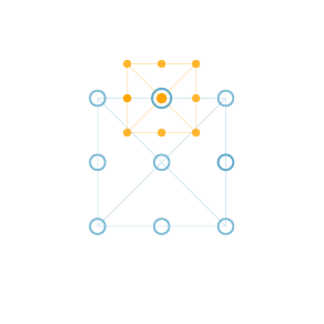
Assuming square boundaries, host in blue, component in yellow.
Context :  , Layer :
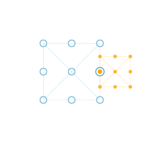
Context :  , Layer :
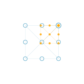
Context :  , Layer :
Context :  , Layer :
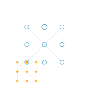
…And so on.
Scale & Translation
Scale & translation are applied after the component has been anchored
| Property | Effect |
|---|---|
| Scale | Amount by which the component is scaled. |
| Translation | |
| Horizontal Offset | Translates the component along the horizontal axis. |
| Vertical Offset | Translates the component along the vertical axis. |
Advanced
Transform options are exactly the same one you can find in the Glyph transformations.
Mirror
| Property | Effect |
|---|---|
 | Flips the glyph horizontally |
 | Flips the glyph vertically |
 | Flips the glyph both horizontally & vertically. Same as doing a 180deg rotation |
 | No scaling will be applied. (rarely useful) |
Rotation & Skew
First, you can choose between the order in which these transformations are applied. Rotation happening after skewing is applied won’t yield the same visual results as if the rotation is applied before.
Shorthand in the drop-down menu are :
- R = Rotation
- X = Skew on X axis
- Y = Skew on Y axis
You may also control which anchor point within the glyph will be used to apply the rotation. Effects might not be much visible depending on which parameters are set before – specifically when using the glyph drawing bounds (), which anchor is selected makes no visual difference.
Special properties
Those few options don’t look like much, but they drastically affect how a component behave, and even how every other components will be transformed.
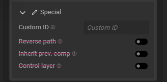
Custom ID
Setting a custom ID allows you to group layers during group editing. Components are first merged for edit using their custom ID, if it exists, and then by their imported glyph.
This is a discreet yet important distinction, as it allow you to easily batch-edit properties on layers importing completely unrelated glyphs.
Path reversing
Path reversing is the poor’s man boolean operation.
This option allows you to effectively reverse the order in which the point are drawn in the vector path. It’s interesting because when two path overlap, if they don’t have the same orientation, they create holes within other.
Usually this is something you want to avoid, but given control over it, it makes it easy to create icon variations that appear to have a background. And other things… probably.
(the effect is much less appealing if a shape isn’t encapsulated by the other)
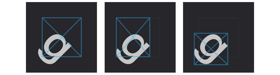
Inherit previous component
When enabled, this option override the host bound so that the component uses a previous one as host.
At the time of writing, the effect is fairly limited since you can’t choose which previous layer, it’s automatically the first visible one.
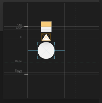
In the gif above, the square inherit the triangle as host, while the main host is the circle glyph. All three are individual glyphs.
This doesn’t look like much as-is, but allows to create complex & reactive encapsulation of components.
Control layer
When enabled, this option override the host bound for every layers, and instead replaces it with its own original (untransformed) bounds.
This is especially useful when working with composite glyphs, for exemple the glyph
éimports botheand'but doesn’t have a path of its own. In such specific case, it’s desirable than theéinherits the bounds frometo stay consistant with the font, all the while staying reactive to metrics updates.
Component states
| Color | Meaning |
|---|---|
| Normal | A very normal component. Boring. |
| Blue | Indicates the component is currently flagged as ‘control layer’. |
| Red | Indicates the current reference within the component creates a circular reference (i.e, import a glyph within itself, or any chain or relationship that would result in a glyph importing itself), and cannot be displayed until the circular reference is fixed. |
Working with group selection
By default, only the components shared by every glyph in the active selection are shown. If you want to see all layer with at least 2 ‘users’, you can enable the Show partial matches toggle.
The
Be mindful when creating new components on a group of glyph. Components are merged for edit based on their imported glyph, hence if you click twice, each glyph will have effectively two empty component, but they will show as one with twice as many users.