While not required, this guide assume that you have made yourself familiar with the
Asset preparation.
What to expect
This guide is about building a simple font using MkFont & Adobe© Illustrator. It’s divided in two part :
Part I is about getting up and running,
Part II glimpse at less obvious features.
Assumptions :
- You’re using Illustrator. (because we’re going to use advanced third party integration)
- You already have a bunch of glyphs designed, laying around somewhere.
- You really don’t want to bother with finding what’s the unicode point fits what glyph.
You can find all the assets used in this example in the following package.
Part I final output
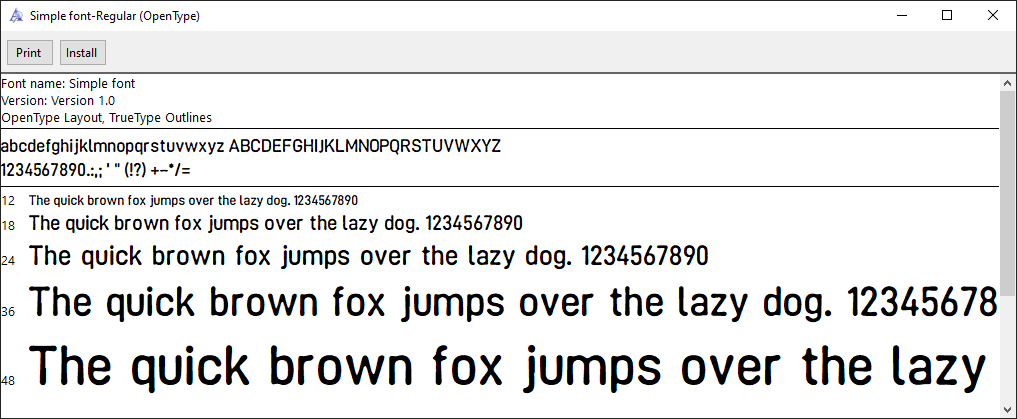
We’re going to make the following font :
Process
First steps
Creating a new MkFont document
Launch the app, create a new .mkfont, and give your font a name.
That’s the name that will be embedded into the exported .ttf.
Part I : Simple Characters
Choosing characters
Let’s say we’re going to support good’ol Basic latin.
What’s going on here :
- First, select the
 Basic Latin unicode block from the
  Content explorer (it’s selected by default when creating a new document)
- Use the +
 action at the top of the Font viewport.
 - This generates a ready-for-export illustrator document, with an artboard for each of the glyphs within the viewport.
Illustrator will very likely complain about executing a script with an unreadable name – it’s all fine. What MkFont does is generate a temp .jsx script and forward it to illustrator in order to generate the artboards.
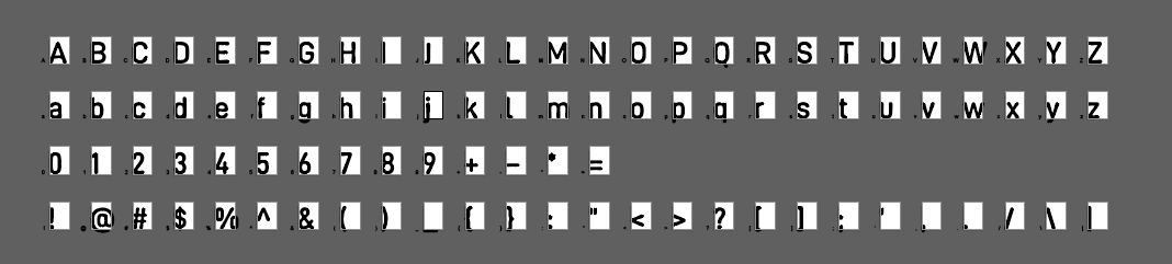
Preparing assets
The first step will be organizing our messed up glyphs into a more structured document, with properly-named artboards : this way we have an export template that we can easily import into MkFont, and make updates a breeze.
The idea is to ensure whatever files we export, we can easily import them to a designated unicode slot without any manual correction.

Vertical placement is critical
The vertical placement of the asset within the artboard will be critical to make the most out of MkFont’s features. It allows for more consistency & predictability in how things will pan out.
If you haven’t already, now is a good time to have a look at the
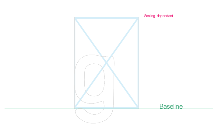
Rule of thumb : the bottom edge of the artboard will be the baseline of your font.
Depending on what kind of automation you want, have an in-depth look at the ![]() Glyph transformations’
Glyph transformations’ Scaling options. How to best position the top edge of the artboard depends mostly on that.
As a default, let’s assume the top edge of the artboard is the ascender of your font. (
)
Horizontal placement really doesn’t matter as much, because you can (and will want to) tweak it.
It does matter more with icons, but still isn’t as critical as top/bottom asset boundaries.
Exporting assets
Once you’re done with placing glyphs to their slot in illustrator, time to export.
Note that it doesn’t really matter if you have all the glyph in there, the MkFont workflow is very flexible in that regard – you can always update glyph data within the app.
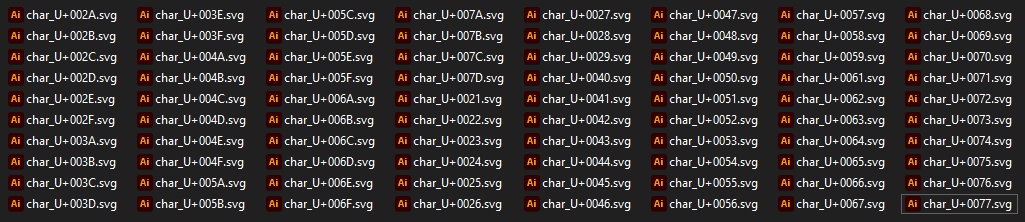
You now need to export each artboard to an individual SVG file.
If you’re using the MkFont-generated document, make sure to hide the helper layers so you don’t export more that you intend to.
The most straightforward way being (inside Illustrator) :
- Open the Export As dialog :
File>Export>Export As - Choose
SVGas file format - Check the
Use artboardoption, then selectAll - Click
Export!
Importing assets
Now the last remaining bit : importing your SVGs into MkFont.
What’s going on here :
- First, click on the
 SVGs to choose a bunch of SVGs to import.
 - Select all the previously exported SVGs.
- Since everything has been templated in the most optimal way, there is really nothing to do here, but validate everything looks as you’d expect.
- Click
 Import.
 - Glyphs have been imported to your MkFont document.
- Check the
 Preview explorer to get a glimpse at your font.
Nice. But it doesn’t look quite right yet.
Let the fun begin
So, you guessed it – this is where we’ll tweak metrics. We’re going broad strokes first, and then in more detail (although this guide won’t cover the nit-picking, that part is up to you.)
What’s going on here :
- While browsing My Glyphs
- Select all the glyphs using
- Go to the
 Glyph transformations panel
 - Tweak
Shift&Pushto give each glyph more breathing room on each side of the imported asset - You can now spend time to tweak each glyph individually.
One last thing
We need to define the space in our font. It’s the very first character of the Basic Latin block.
What’s going on here :
- Select the
SPACEunicode slot - Use the
 from the
  Glyph inspector to create an empty glyph there
 - Adjust the width
- That’s it, that’s the
SPACE.
Export to TTF
Done! To export the font, simply click on the ![]() Export action in the top left of the editor.
Export action in the top left of the editor.
Part II : Composite characters
Now that we’re done with the basics, let’s add a few more characters from Latin-1 Supplement, but this time with a slightly different manipulation.
We’re going to leverage known character decomposition to create modular glyphs from the one we already have, instead of creating new assets.
What’s going on here :
- Secret sauce is : use + to boostrap decomposition creation.
WORK IN PROGRESS.
Come back later (~ ̄▽ ̄)~
Wrap up
There’s no magic involved with the decomposition, in perspective of the whole Unicode database, very few are documented. To know if a glyph has a known decomposition, you can check out the ![]() Glyph details!
Glyph details!
If you’re interested in digging deeper into components interactions, check out the ![]() Composite icon font :)
Composite icon font :)