While not required, this guide assume that you have made yourself familiar with the
Asset preparation.
What to expect
This guide is about creating a simple yet highly customizable icon font; and showcasing MkFont advanced component interactions. It only assumes that you have some assets to work with, and that you are using Adobe© Illustrator, because that’s what you’ll see in the screenshots – but any SVG editor will work.
We will be making roughly the same font icon as the one made through the  Simple icon font guide.
Credits
This example is using Kenney’s Game Icons, which you will find packaged along with this guide’ files, downloadable here.
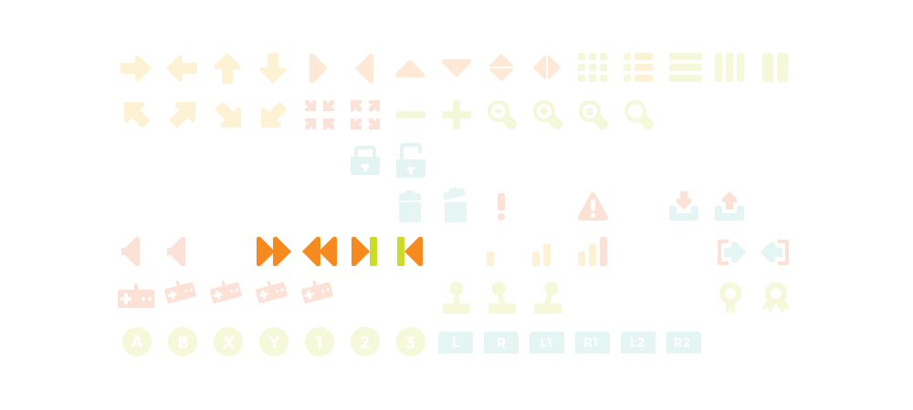
Final output
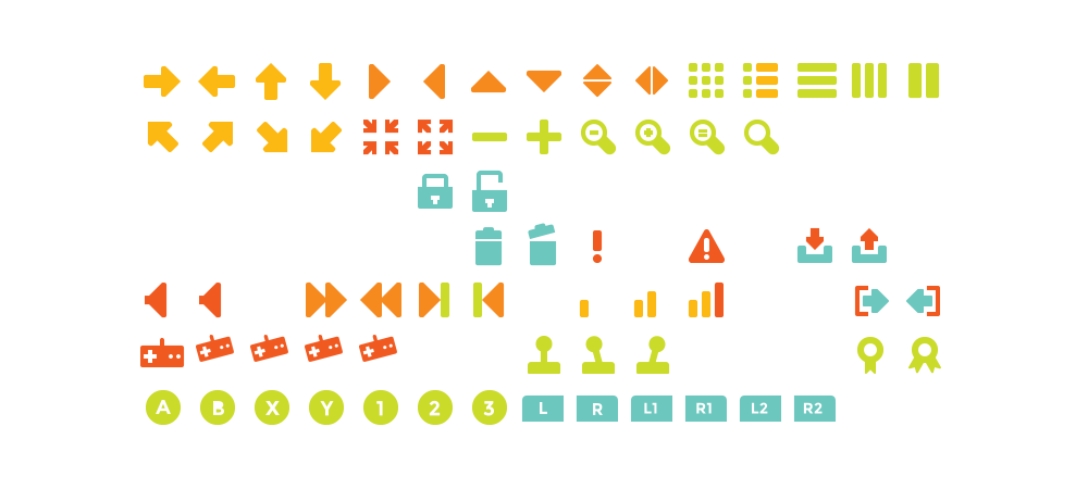
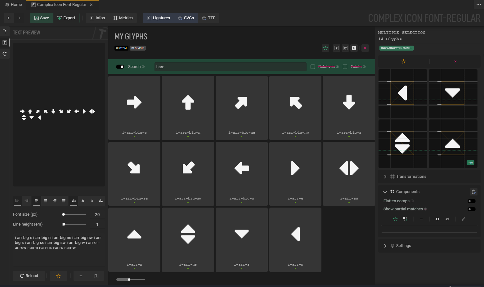
We want a font with the following characters in it :

Process
First steps
Breaking the design into components
So, this one is a bit of a cheat because we know from the start what we want to icons to look like, which makes the process of breaking things into components much easier.
First, let’s roughly identify re-usable bits; loosely grouped by colors :
Each color group represent a single asset that can be re-used to create multiple glyphs – thus speeding up the iterative process if updates need to be applied, or style tweaked.
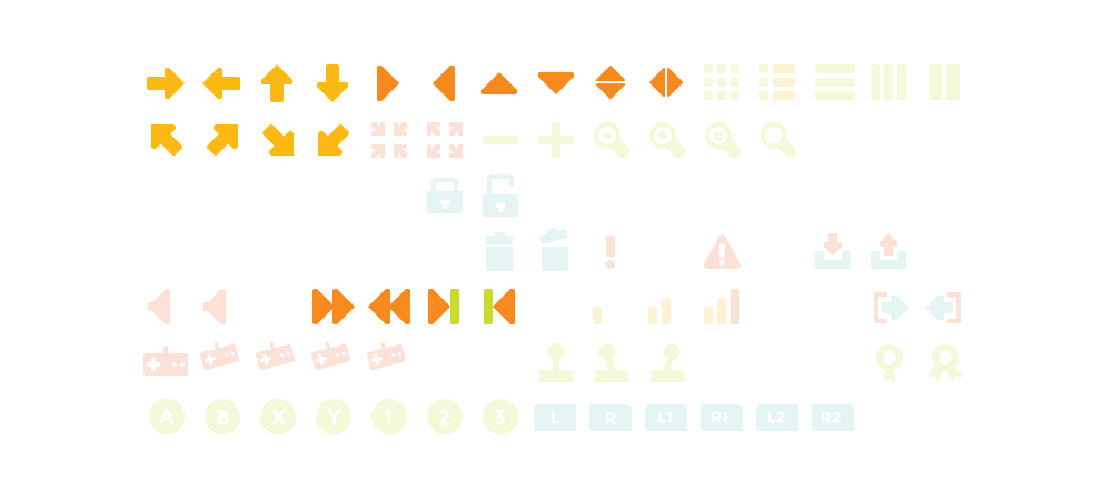
For the purpose of this guide, we will only focus on the composite icons, and ignore the ‘hardcoded’ ones.
Naming components
First thing first, we’ll need names for these icons & components.
Let’s go with a simple naming convention : components will be prefixed with a c-, and icons with an i-.
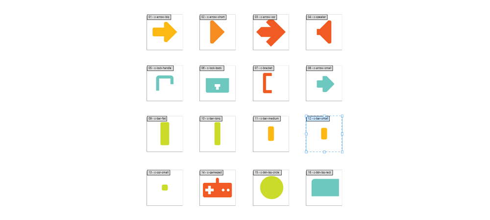
Here’s the names I’m using for the components (and thus artboards).
Show breakdown & name associations
| Component | name |
|---|---|
 | c-arrow-big |
 | c-arrow-short |
 | c-arrow-small |
 | c-arrow-sqr |
 | c-bar-fat |
 | c-bar-long |
 | c-bar-medium |
 | c-bar-small |
 | c-bracket |
 | c-btn-bg-circle |
 | c-btn-bg-rect |
 | c-gamepad |
 | c-lock-body |
 | c-lock-handle |
 | c-speaker |
 | c-sqr-small |
Loose artboard setup
We’re looking to have one svg file per component; so let’s do a basic artboard set-up.
Note that we don’t care about alignment here, but we do care about having a consistent scale to make our lives easier.
Another way to do it would have to copy and paste vector graphics directly into the app, but that’s a bit tedious.
I don't care about the artboards, I want to copy-paste
First, you will need to create ligatures for each of your components (unless you want to use existing unicode slots), as this would normally be automated through batch import.
In order to do so, use the  Ligatures finder’s
 one ligature per line feature, with the following input :
c-arrow-big
c-arrow-short
c-arrow-small
c-arrow-sqr
c-bar-fat
c-bar-long
c-bar-medium
c-bar-small
c-bracket
c-btn-bg-circle
c-btn-bg-rect
c-gamepad
c-lock-body
c-lock-handle
c-speaker
c-sqr-small
Then, in the  Content explorer, naviguate to either My Glyphs or Ligatures. From there, you can select glyphs and copy-paste your assets from Illustrator to MkFont; or import individual SVG files using
  at the top of the
  Glyph inspector. Handy!
Naming icons
We’ll need some names for our icons, as well. We could skip that bit for the sake of going faster and adding icons to any existing characters BUT; having them as ligatures will allow for more flexibility down the line : this will allow us to choose where to put our icons.
The “data structure” will look like : components (custom ligature) -> icon (custom ligature) -> unicode slot (know unicode slot). Again, this is not mandatory, but makes things more re-usable and flexible.
List of icons names
Per color group, ignoring some of them, as well as the white ones :
i-arr-big-e
i-arr-big-w
i-arr-big-n
i-arr-big-s
i-arr-big-nw
i-arr-big-ne
i-arr-big-se
i-arr-big-sw
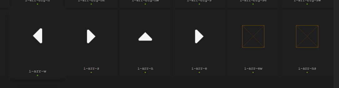
i-arr-e
i-arr-w
i-arr-n
i-arr-s
i-arr-ns
i-arr-ew
i-grid-9
i-list-a
i-list-3-h
i-list-3-v
i-pause
i-reduce
i-expand
i-minus
i-plus
i-mag-minus
i-mag-plus
i-mag-equal
i-mag
i-locked
i-unlocked
i-bin
i-!
i-warn
i-dl
i-ul
i-spkr
i-ffw
i-fbw
i-next
i-prev
i-sig-low
i-sig-med
i-sig-full
i-gp
i-plyr-1
i-plyr-2
i-plyr-3
i-plyr-4
i-btn-A
i-btn-B
i-btn-X
i-btn-Y
i-btn-1
i-btn-2
i-btn-3
i-btn-L
i-btn-R
i-btn-L1
i-btn-R1
i-btn-L2
i-btn-R2
i-medal
i-medal-2
Creating a new MkFont document
Launch the app, create a new .mkfont, and give your font a name.
That’s the name that will be embedded into the exported .ttf.
Importing the components
We’re going to batch-import our components, it’s pretty straightforward :
What’s going on here :
- First, use
 SVGs to choose which files to import.
 - If you have a strict naming convention, MkFont will be smart enough to isolate all common characters within the list of filenames, and strip them down. We just edit the automatically found prefix to make sure it doesn’t strip down our
c-, which will come in handy for the search.In our case, SVGs have been batch-exported from Illustrator, and are all named as icons_
artboard_name.svg. Since we’re not importing anything else, thec-is flagged as common to all imported filenames. - Since we’re importing icons and not tight characters, We changed the boundary mode to
importedas opposed the default,mixed(more suitable for characters). - These are square artboards, we will tweak a few additional settings in order to have them best-fitted within the font :
- Scaling is set to
 so that they match the Family height metric
 - Tweak the alignment & anchoring of the glyph so it is centered within our family metrics with (
 &
&  ) as opposed to the default
  that make the imported bounds sit on the baseline.
- Scaling is set to
- Select the Ligatures, and here they are, correctly named and imported.
Reminder that any transformation tweaks made during import can be changed afterward – it is available at import time for convenience only! In-depth infos :
Glyph transformations &
Colors are ignored and stripped down on import.
Creating ligatures to host the composite icons
Now that we have our components imported, we’re going to need to create ligatures : they will host & transform components.
A sensible list of icon is available in the details of the Naming icons bit above – we’ll be using the Ligatures finder’s one ligature per line feature, and  Create all of them.
What’s going on here :
- Paste a list of names separated by a new line into the Ligatures finder.
- Enabling
one ligature per line, so each line is treated as a single ligature to be imported - Since we want them all, no point in selecting them one by one (this is only useful while doing text analysis), use the Create all action.
Creating composite glyphs
Ok! Let’s get to the meat of it.
What we want to do now is rebuild our initial icons using the re-usable pieces we imported originally.
The easy ones
Add, rotate
We’re going to start with the obvious, easy ones : arrows with basic transformations.
What’s going on here :
- First, turn the search ON, and look for ligatures with
arr-bigin their names. These will be the 8 arrows icon pointing at cardinal directions. - Select the 8 glyphs in the viewport.
- With the group selection active (which, since everything is empty, doesn’t look like much), move to the
 Glyph components and open the glyph picker (
 ).
). - From there, select which glyphs to create components from : there’s just one in our case.
- Confirm the component creation with Add selected.
- Change the boundary mode of the component so it fits the component itself – this way it’s perfectly centered
- Up the scale a bit, since the initial arrow felt a bit too small. It can be changed it later anyway.
Then, individually edit each component to give it the right orientation.
Do so by selecting each ligature individually, and edit the Rotation value in the Glyph components’s Advanced properties. And that’s it, we’re all set with the first batch of big arrows.
Add, rotate, anchor
Rince & repeat for the other arrows – although with a twist.
The first four as easy ones, like the previous arrows above
The remaining two will combine two components :
What’s going on here :
- First, select the
i-arr-ew(or whatever name you used) - Again, use to add components to the glyph. Only this time, select and add
i-arr-e&i-arr-w. - The components have their default transform, which is not what we’re looking for. We will change the
anchoring&boundaries, and add anhorizontal offsetso they are still aligned toward the center, but fit more snugly toward each other. -
 is used in order to ignore the horizontal offset of the asset within the imported glyph.
Repeat the same process for the vertical versions; this time using .
.
Change propagation
By that point, you can already see how changes are propagated if you edit the original arrow component, c-arrow-short :
Awesome, here’s what it should look like:
Add, relative, flatten
Next up are these smaller arrows, which we’ll use to demonstrate how to align a component toward another, and then flatten the result to ensure it stays centered within the glyph.
Namely, i-ffw, i-fbw, i-next & i-prev
What’s going on here :
- Import
i-arr-was component intoi-fbw, twice. - Change the top one
boundaries&anchoringfor both its context and itself to, to have a tight fit, aligned to the left. Up to that point, this component is still aligned toward the host.
- Enable
Inherit prev. comp. This effectively changes the typographic space of that component with the one from the first component below it. Nice, but not quite aligned. - In order to align the entire composition within the host, enable
Flatten comp. What this does is tell the host to use its components as if they were a unique path. Althought it doesn’t look quite right now : let’s adjust the host transform. - Change the scale to manual () with a value of
1: this way we ensure component scale is driven only by the components. - Change
boundaries,anchoring&alignmentso the graphics are centered within the typographic space.
Ok that was tedious, we still have 3 more to do? Nah.
Simply copy-paste & simply swap components to the right one!
What’s going on here :
- First select
i-fbw - Use to store the selection in memory
- Select the glyphs you want to paste to, and hit .
- Edit each glyph by expanding individual component, and pick another one using the
 .
.
WORK IN PROGRESS.
Come back later (~ ̄▽ ̄)~
Removing the components from the font
Now that we have what we want, we’ll remove our components from the exported font. Since they’re assets, there’s really no point in exporting them.